


Brand
ReBrand ReView: Statewise
Did you notice Statewise's rebrand? Learn more about where it's been and where the brand is headed, along with commentary.
Did you notice Inspiren's rebrand? Learn more about where it's been and where the brand is headed, along with commentary.
Morgan Kenney, Director of Marketing at Inspiren sat down to chat about the company’s rebrand. Stick around for a teardown and peek behind the curtain to see how this rebrand went from concept to go-live.
About the brand: Founded in 2016 by former Green Beret and cardiothoracic nurse Michael Wang, Inspiren is senior living's first complete AI-powered ecosystem. Trusted by communities nationwide, Inspiren empowers care teams with real-time behavioral alerts, fall detection, and ongoing care utilization insights. The privacy-first design enhances resident dignity while improving clinical outcomes, staff efficiency, and family communication. For more, visit their website: inspiren.com
“It was just a natural evolution of the company. The original brand supported the efforts we needed at the time, but we really wanted to trailblaze what it meant to be an innovative company in senior living,” Kenney shared. “If you look at our current brand, we took some risks. In October of 2024, we conducted listening sessions with the executive team, and we wondered about how we balance being bold with being authentic? What came out of that session was defining our core values and how we can stay true to them. We knew we wanted to be bold, stand out, and showcase our innovation. But, we also wanted to make sure that it felt authentic.”
“Our original offer wasn’t as extensive as it is today. As we were preparing to launch the ecosystem, which includes emergency call capabilities, we knew it was a really great time for us to go-to-market with a new look and feel,” Kenney added. “Our brand launch happened on the same day as our ecosystem announcement, charging toward a conference-based launch. The website went live, and Mike went on stage to announce the ecosystem at the same time we launched the brand. The pressure was on to make sure everything went smoothly and to have all of the assets prepared on time.”
Before going too much deeper, it’s important to understand the state of senior living operations. According to Senior Housing News, most operators are juggling two to three core platforms while 30% use four or more. This doesn’t—on the surface—sound like much, but when you layer on larger, enterprise size with different life plan options, staff training plans, demographics, staffing problems, and integrations, etc. it can quickly get out of hand.
With the fight for talent and growing demand for care services, operators need systems that grow and flex. That’s what Inspiren is crafting; it’s something that meets operators in a pivotal moment.
“We did a lot of analysis within our market and space. We analyzed some brands we thought we wanted to emulate or be on the same playing field as in the healthtech space,” Kenney shared. “One thing I know, coming from a background in healthtech, is that it can be stagnant. It’s really important to stay out of that bubble, and not just look at brands that are very similar to yours for inspiration.”
One interesting tidbit that came out of talking to other healthcare marketing leaders wsa their source of inspiration. Laina Health looked at the earth tones from the men’s line of Method body wash. With the National Alliance for Caregiving, they looked at the Commonwealth Foundation as an example. Maxwell TEC found inspiration from Apple. Anecdotally, a few that I’ve talked to on the health tech side have also mentioned Palantir, Figma, and Notion as well.
“When it came to competitive analysis, we looked at what our market was doing, but we also sought inspiration outside of that. Another aspect we focused on was how we would be perceived by all of the people that we’re connecting with. Inspiren connects not only with capital partners but also with operators, care teams, and families,” Kenney added. “We knew that our brand had to be approachable for everyone that we communicate with. If you look at our brand guidelines, you’ll see that we have a product that’s built on the foundation of AI.”
“It would be really easy in today’s world to lean really heavily into that AI space. In talking to our personas and each of our ICPs, we had to make sure it was authentic.”
“With our strategic positioning, we were the first to market a full ecosystem. We had some competitors in the fall mitigation space, emergency call, and other ancillary services. By combining those services with what we were doing with AUGi and emergency calls, we had an opportunity to think about how we wanted to approach that in-market. There wasn’t anyone else for us to look at as an example.”
The comprehensive offering or horizontal expansion to offer more solutions (within the same industry) is part of a growing trend in healthcare/tech rebrands, particularly post-pandemic. This is driven by a variety of factors including technology consolidation pressures, private equity, interoperability, and more.
For Kenney, “This also meant conducting research and sessions to understand:
To put the verbal identity changes in context, let’s review the website, before and after the rebrand.
|
Before |
|
|
After |
|
When reading further into the home page, the positioning and messaging feature a warmer, unified feel. It blends the product with how residents live and how clinicians and operators use the system itself.
Their new website gives the visuals the room to breathe and show (rather than telling).
“When you think about colors, our icon is that raspberry pink color. You don’t really see that as a brand color—at least not in health tech or health adjacent spaces. Typically, you see blue or a clinical, lighter blue. We took a risk, and it ended up paying off,” Kenney added.
To show how the logo compares to the last one, let’s look at both.
|
Before |
|
|
After |
|
“We have a lot of brand awareness and recognition over the last nine months. It’s also fun. People want to use it. Our clients ask for swag, and they want to represent us because it’s a really cool look and feel.”
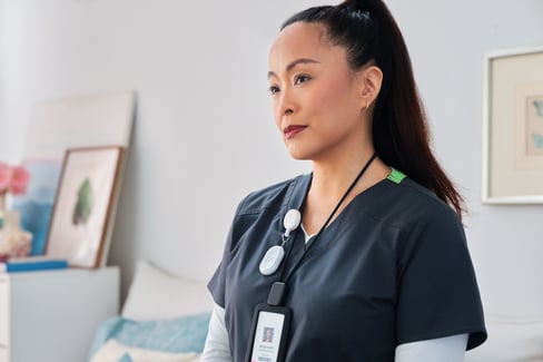
“Continuing on the theme of authenticity from earlier, our brand standards are focused on using real people in our imagery. One of the things that I said when we were doing our photo shoot and video shoots, was: wrinkles are celebrated. We’re celebrating a special time in a person’s life. We really wanted to stay true and make it approachable, which means that the people we’re shooting and sharing have to be real.”
An example image that’s used on Inspiren’s current website
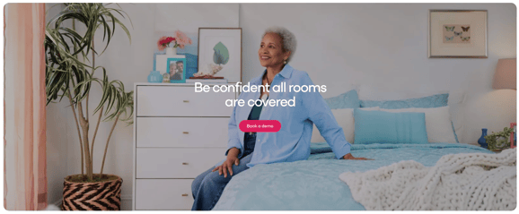
“To add, we also wanted to balance product imagery with lifestyle imagery. The reality and inspiring part is that we have built cool technology. If you go to our website, you’ll see a balance of lifestyle and more product-forward imagery.”
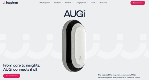
An example of product-forward imagery on their website
The rebrand was a combination of in-house and agency. To get everything rolled out in-time, Inspiren engaged several partners to make their rebrand possible. “Anything that you see from a video and imagery perspective, came from Howdy, an agency based out of Manhattan.”
“In thinking about our visual identity, we also had to update our packaging system. We wanted all stakeholders would instantly get that our new brand—and what it meant for them. We updated every asset and touchpoint, and we slowly rolled everything out over time."
“Inspiren is naturally a harder word to pronounce. The way that we think about who we are and how we interact with clients is two-fold. We think about it in two circles. There’s the human element, in the way that we position our brand. It needs to be approachable, authentic, and caring for the people who serve others. The other side of the circle represents the technology piece.
In the Chinese character, when the two circles come together—our favicon shape—is the word “ren.” When we think about inspiring humans, inspiring change, we’re also inspiring altruism and humanity. Those two things come together to create inspiren. It’s a beautiful thing.”

Here is what the character looks like. (Image credit)
The word, rén, is a fundamental building block of the Mandarin language. It can be used to refer to people or persons, nationality or origin, professions or status, other people, or to refer to the body/human nature.
“If you go to the website—it’s my favorite thing that we’ve created for the website—to the About Us, under Company, you’ll see the two circles coming together: ‘inspire change, lead with humanity,’” shared Kenney.

Here is CEO, Michael Wang’s post explaining the name—and the pronunciation.
Because of all of the hard work that went into building the rebrand, it resulted in success. Check out this post from one of their investors promoting an interview with Fierce Healthcare following the ecosystem launch:
What makes the rebrand robust is making a true, operational transformation. This wasn’t just a new color palette, this was creating unmatched results for their customers. Some of the metrics as shared on their website:
Those are significant findings! Every second, an older adult falls in the US. One in four older adults falls each year.
Preventing any of these means thousands in savings on medical and emergency room bills, expensive rehabilitation, and, not to mention, disruption of life and routine.

“I would advise other people not to be afraid of getting outside of the healthcare box when exploring opportunities or programs. There are a lot of innovative things happening outside of healthcare and healthtech. Looking outside of your normal group can help you get inspiration and ideas.”
“Approach rebranding in a way that gets people excited, but also for people to understand and resonate with.” Curious what rebranding the right way can result in? Learn more in this blog from Primary Venture Partners on why they doubled down on Inspiren.
To learn more about Inspiren, check out their website: inspiren.com
Interested in seeing how a marketing partner can help you bring your healthtech company’s rebrand or brand vision to life? Get in touch with Jenn today.
Did you notice Statewise's rebrand? Learn more about where it's been and where the brand is headed, along with commentary.
Did you notice VNS Health's rebrand? Learn more about where it's been and where the brand is headed, along with commentary.
Did you notice LainaHealth's rebrand? Learn more about where it's been and where the brand is headed, along with commentary.