


Brand
ReBrand ReView: WelcomeHome
Did you notice WelcomeHome’s latest brand evolution? Learn more about where it's been and where the brand is headed, along with commentary.
Did you notice Home Instead's latest brand evolution? Learn more about where it's been and where the brand is headed, along with commentary.
About Home Instead: Home Instead is an in-home care company based in Omaha, Nebraska that was founded by Paul and Lori Hogan in 1994.
Speed Dating Round:
|
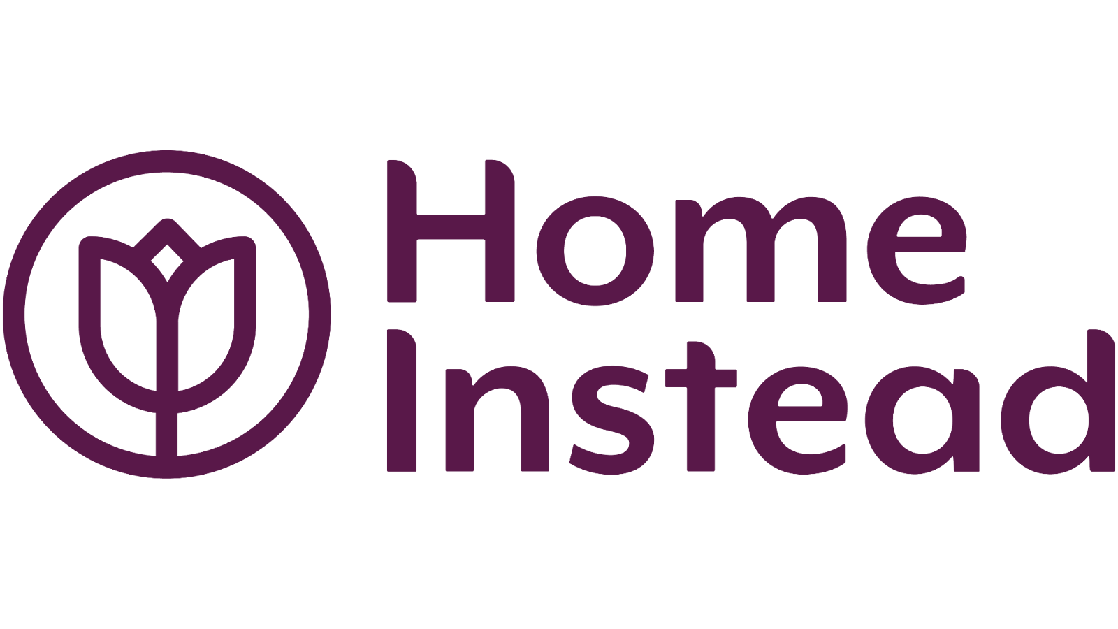
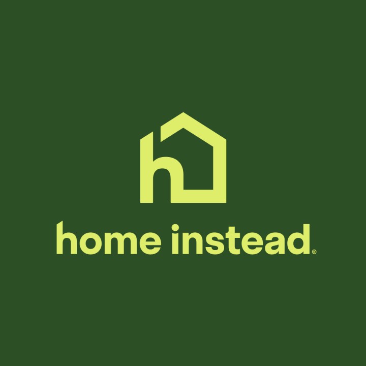
Former Logo |
New Logo |
|
|
|
|
Former Font |
New Font |
|
Mr Eaves XL (with custom rounded components) |
Plus Jakarta Sans |
|
Former Color Palette |
New Color Palette |
|
|
|
|
Former Refresh Date |
New Rebrand Date |
|
January 6, 2021 |
December 16, 2024 |
|
Former Agency |
New Agency |
|
Energy BBDO |
FCB Chicago |
|
Former Brand Campaign |
New Brand Campaign |
|
A Life Well-Lived Should Continue at Home |
A Better What’s Next |
Home Instead has gone through a number of brand evolutions and refreshes since its founding. From 2008 to 2020, the brand had the same logo. It was the same color palette up until its most current rebrand, with a Verdana font and some accents.
One of the most notable changes from this logo to the 2021 version was the removal of the “senior care” language under the brand name. According to the press release, this change was intentional and “meant to be more inclusive and a reflection of the evolving global language around the way people talk about older adults. The name change also allows the brand to more broadly address helping aging adults meet their needs wherever they are on their care journey.”
Interestingly, after this rebrand occurred on January 6th, 2021, the company was acquired by Honor on August 6th, exactly seven months later. Honor was originally founded “as an on-demand home care company, but eventually pivoted its business strategy to become a partner to at-home care agencies and other senior-focused providers. The company uses its technology infrastructure to take over billing, scheduling, staffing and other back-office functions for a negotiated share of its agency partners’ revenue,” as mentioned in Home Healthcare News.
Almost three years after its last brand refresh, on December 16th, 2024, Home Instead began the next evolution of its home care brand and model with a focus on helping older adults live a better what’s next.
Standing out amongst a slew of pinks, purples, and blues and logos shaped like hearts and hands, Home Instead carved a niche for itself, building on its existing brand equity and market share.
The brand was likely trying to pivot from its former identity—before the Honor acquisition—and move more closely to that of Honor. Home care companies don’t tend to rebrand often; it is a calculated decision that the company makes to keep up with trends and get ahead of them.
As one of the oldest national (and international) home care franchise brands, Home Instead has found a home inside the hearts of over 100,000 clients (and Care Pros) across 1,200 franchise locations.
But, what about people who haven’t used Home Instead yet? Would they choose this company over another, or choose Home Instead over the current alternative of family caregiving?
For better or for worse, one of the elements that was removed in the rebrand was the tulip, an emblem that had withstood several brand evolutions. The flower “has come to symbolize the highly personalized care [Home Instead is] known for,” according to a press release from a former rebrand. Would consumers be able to make this connection?
This rebrand likely came on because of a couple of things:
The themes of flexibility and modernization come up again and again in subtle ways.
Looking at the former brand’s campaign: A Life Well-Lived Should Continue at Home, signals rigidity, a linear motion from A to B. Contrastingly, the brand’s new campaign tagline: A Better What’s Next, opens up the world of possibility. The phrase is open and gives breathing room for whatever that “next” could be, also applicable to and giving space for CarePros to have a talent brand that fits squarely into the brand house as well.
Upon reviewing old brand spots, one theme was clear: dependence. Older adults were portrayed as overly dependent or helpless in their homes, necessitating a caregiver’s assistance in the home. The new brand shows a more level power dynamic, showing positive moments and interactions between caregivers and their clients.
Visual Elements: Home Instead took a stark departure from its tulip roots, diving away from their signature maroon color into various shades of green, and neutral secondary colors. There is also a mix of icons and images that keep a user interested on a page, especially with imagery of objects you’d find in someone’s home. The brand’s former icon library utilized multiple colors, making it hard to use on certain formats. The new library features single-color icons, making them more adaptable and flexible on various mediums.
The typography is also easier to read, although, the old typography scheme was familiar and its secondary font was a handwritten script, giving it a “homey,” handwritten-on-cardstock family recipe feel. The old body copy, however, used an Arial font which is very accessible and easy to read.
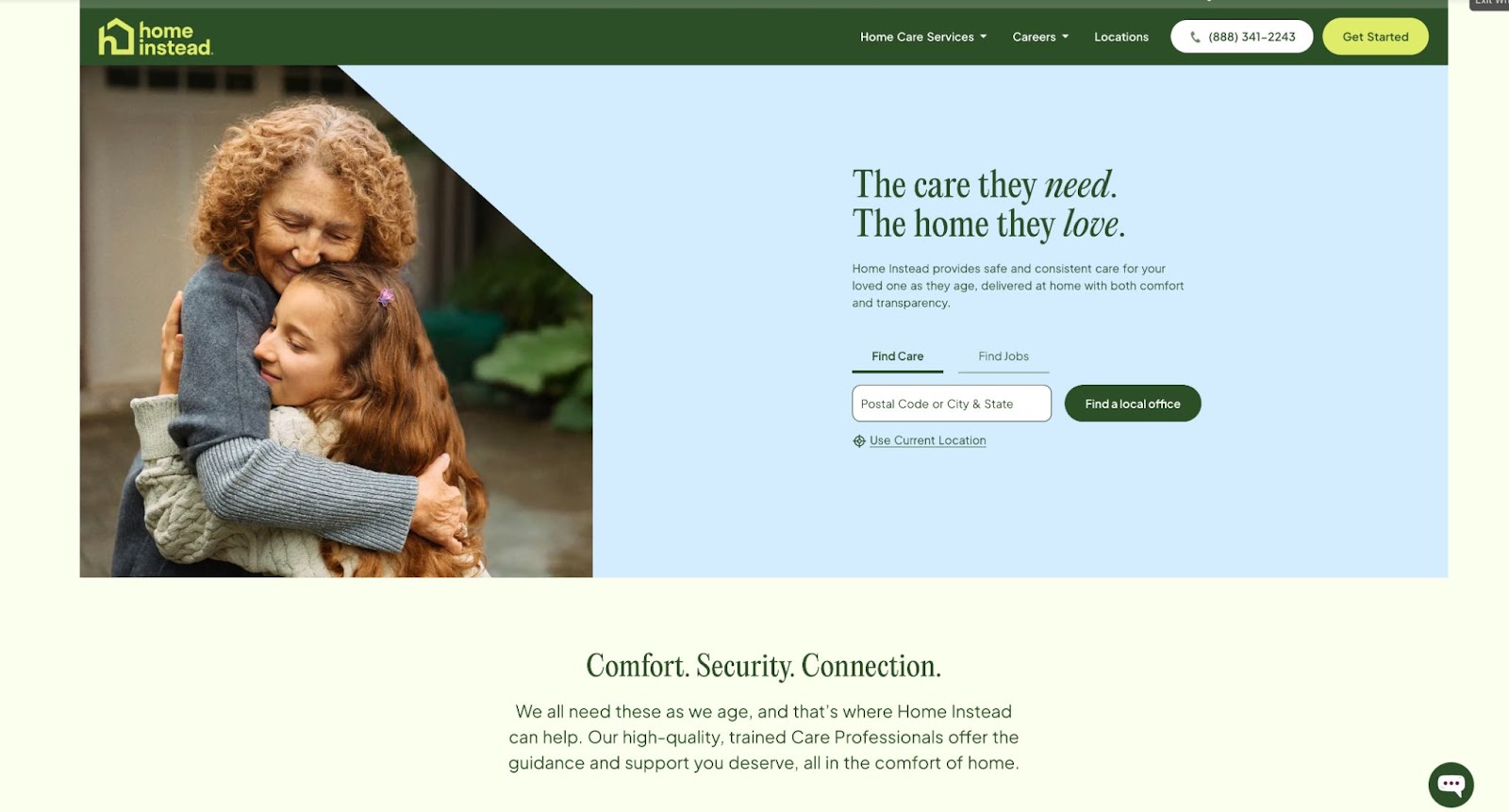
Messaging: Home Instead’s tagline, for a long time, was “To us, it’s personal.” It was stamped on nearly every web page, client folder, tote bag, and pen. On the current home page, where that copy was, you’ll find: “The care they need. The home they love.”
The new messaging appeals to the eldest, adult daughter, rather than keeping it open-ended to referral partners, healthcare professionals, and other relatives (like they used to). Likely unrelated to the rebrand, over the years there has been a shift from Home Instead referring to staff as CAREGivers, to now: Care Pros (likely a development that came from Honor).
Strategic Positioning: Beyond the messaging, there is a level of commitment and promise that the brand makes that seemingly attempts to differentiate it from other companies. This could be marketing language, but the site mentions: “And, we’ve got you covered for tomorrow.”
It’s simple, yes, but a promise many agencies often cannot keep. It’s important to stay honest in messaging and being able to back up statements made on a website, especially for a service as time-sensitive and intimate as home care.
What this rebrand is missing though, is some rationale explaining the purpose of the rebrand (why now, why these colors, etc…) like they did with their last refresh. People are left to piece things together and speculate.
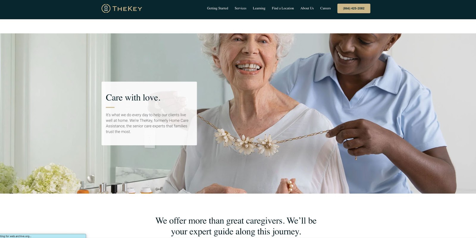
The rebrand features new people, and a marked shift toward the upper class (at least in the imagery selection process). The use of the dark green color, the PP Editorial New as the header copy font, and the new image library brings to mind two things: TheKey’s rebrand from early 2022 (see below), and it signals a shift in Home Instead’s core audience.
The new audience? Half of it stays the same, the adult daughter, of course, but there’s also a shift toward the upper-class, private pay crowd. Care costs are climbing and although Home Instead franchisees are likely aware of these market dynamics, in order to stay competitive, they have to appeal to the right demographics who can afford care.
In terms of brand values (or what least what can be learned), there are a few that can be extrapolated from the short spots we see on social media and from the website:
One small point about the logo transformation, if you look at the old Home Instead logo, the H and the I are sentence case. If you look at the new logo, everything is lowercase. Is this signaling a nod to the younger generations like Gen-Z?
The rebrand has been out for just under a month (as of this writing) and has mostly garnered positive attention and feedback, especially from corporate team members and Care Pros.
With the shift in the new look, I anticipate Home Instead being able to shift some of the market share away from TheKey (formerly Home Care Assistance) with their similar look and premium feel. This is also apparent in Home Instead’s intention on the corporate social media pages.
Using captions like “Every January is a blank page, and your story is far from over. Whether you need a little help or a lot, Home Instead is here so you can continue living life on your own terms—independently and comfortably at home” can captivate hearts and minds of those interested in aging and place and their family members.
Each interaction across the buyer’s journey can be an important factor in a family’s consideration process, especially when it comes to answering the first phone call.
Alright, here’s my disclaimer, followed by the real stuff: I used to work at a Home Instead location as a caregiver and Assistant Client Care Manager when it was the “old logo.”
This (the old) logo worked. It was different. The brand name and color became a household name. The common home care logo tropes today are houses, hearts, and hands, the dreaded 3H’s. I think Home Instead could be an equally (if not more) formidable brand had they stuck with a more conservative refresh as they had done, with updated messaging and positioning, a monochromatic icon library, and new imagery.
I don’t think this was a “bad” rebrand, but what I am saying is I think they could’ve done more or better keeping the guts of what they had before with some minor improvements and tweaks along the way. I would rate it a 7/10.
Only time will tell how the rebrand is received, and I’ll keep this post updated as I hear more. What do you think of the rebrand?
Did you notice WelcomeHome’s latest brand evolution? Learn more about where it's been and where the brand is headed, along with commentary.
Who said healthcare can't be fun? See if your brand made the cut, and comment or link your favorite ones.