

Brand
ReBrand ReView: Private Home Care
Did you notice Private Home Care's rebrand? Learn more about where it's been and where the brand is headed, along with commentary.
Did you notice the Ours Privacy's rebrand? Learn more about where it's been and where the brand is headed, along with commentary.
Sophia Zey, Head of Marketing at Ours Privacy, sat down to chat about the company’s rebrand. Stick around for a teardown and peek behind the curtain to see how this rebrand went from concept to go-live.
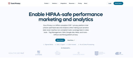
About the brand: Ours Privacy is a HIPAA-compliant customer data platform (CDP) built by healthcare marketers for healthcare marketers. The platform helps health systems, digital health companies, and medical brands modernize their marketing while navigating a rapidly evolving privacy environment. Ours Privacy integrates with major channels, including Google Ads, Meta Ads, CRM systems, scheduling platforms, data warehouses, and more. For more information, visit www.oursprivacy.com.
“Ours Privacy has evolved quite a bit. Four years ago, we were a B2C company focused on national telehealth called Ours Wellness, and we had a totally different brand (which also went through several rebrands),” Zey added.
Before we get too deep in the weeds, let’s do a brief history 101 on healthcare advertising and marketing privacy.
The Department of Health and Human Services (HHS) Office for Civil Rights (OCR) issued a bulletin, in 2022, stating that Health Insurance Portability & Accountability Act (HIPAA) protected entities are not permitted to use tracking technologies.
What does that mean? This meant that hospitals and other entities that served patient-facing, publicly accessible content had to ensure that any means they used for digital advertising or marketing had to be HIPAA-compliant. This put providers in a sticky situation, having to find third-party vendors they could trust, to help them deliver these campaigns on HIPAA-compliant channels and means.
Example: You go to a local hospital website and click on their oncology page. Your user session is tied to your IP address, potentially linking your identity and location to an associated illness. To the OCR, this could be viewed as a HIPAA violation.
With this new interpretation, class action suits, FTC actions, state law updates and changes, and patient breach notifications are real, potential risks for covered entities.
Zey added, “With the 2022 crackdown, HSS guidance, rulings, and pixel tracking lawsuits coming into the foreground, we were getting asked frequently: How are you doing this? How are you still running ads in a compliant way? After having the same candid conversations with healthcare marketers again and again, we realized we were facing a much bigger, industry-wide problem. So we took what we had, and rebuilt it from the ground up as a modern, scalable platform designed specifically for healthcare marketers with built-in privacy and compliance defaults.”
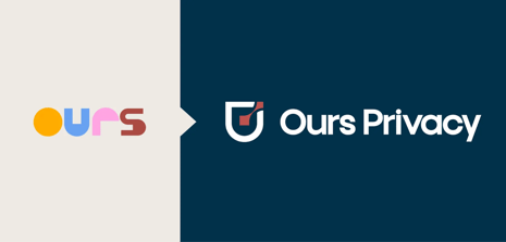
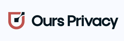
This is what the original Ours Wellness brand looked like, next to its current (rebranded logo).
“Before we knew it, Ours Privacy was born. We started with a scrappy shield logo that our co-founder, Adam Putterman, created in Figma by himself.” Check out his rebrand announcement on LinkedIn featuring the logos side-by-side.
“We had a bare bones website: something to show people. We saw a need for a product before we really even had much time to develop the brand. After a while, the website wasn’t quite reflecting our full capabilities. We were hearing: "I didn't know you guys did this."
“We needed our brand and our website to reflect how far we’ve come,” Zey continued. “We were also on a race against the conference season clock to make sure that we had our new brand assets in time.”
“We didn’t do—what I would call—a total rebrand. It was more like a brand refresh. We took what we had and elevated it.” For example, the original Ours Privacy brand revolved around just one color, the same red hue from the previous Ours Wellness brand.
They worked with the design agency Slam.Studio who conducted an industry color analysis to identify color opportunities in their space. After evaluating multiple color palette options, they selected a blue-based palette that incorporates the original Ours Wellness red as a nod to their roots.
In looking at the competitive landscape that Ours Privacy operates within, there’s a lot of messaging that makes strong claims, and can make teams feel poorly about their tech stack (rather than remaining solution-based).
This fear-based messaging can rub users the wrong way and make them feel uneasy about their situation, regardless of where they’re at in the buyer journey or in the assembly of their privacy/security stack. The content I found also felt overly technical and difficult to approach.
“In the privacy space, there's a lot of fear-mongering, which is warranted with all the lawsuits. But, when you start with fear, it can be off-putting. We try to lead with care and approach it from a protection angle.”
To see their new website in action, review the screenshots below.
|
Before |
|
|
After |
|
Their mission, however, remains unchanged: “to help healthcare organizations reach patients with the information and care they deserve, while protecting privacy every step of the way.” Read their rebrand announcement blog here.
One of my favorite parts of the announcement is the renewal of values: care, trust, and partnership. Partnership, in particular, and this is the description: “We know what it's like to balance patient outreach with privacy requirements under pressure. That's why we're here for the long haul - from setup through ongoing changes in regulations - treating your compliance challenges as our own.”
The lumping of their ICP’s problems with their own, turns the “you” into a “we.” Sometimes, this can sound a bit gimmicky, but in this context, it feels right.
Marketing is a unique department; marketers need to feel related to, especially when evaluating a potential tool in their tech stack. And Ours Privacy fits right in.
“We kept the shade of red that goes back to our Ours Wellness days. The other element we wanted to keep was the shield, which goes back to our protection value,” shared Zey.
Red has a home in healthcare branding, since red signals urgency, energy, or heart health. The shield also has heavy visual stock in the healthcare industry, symbolizing safety, trust, and defense. Some healthcare brands that use a shield logo include: Mayo Clinic, Blue Cross Blue Shield, and various state public health departments.
“Our design studio mapped our competitors on the color wheel so we could make sure to use colors that differentiated us,” Zey added. “After doing all of the initial research, we partnered with Slam Studio for the visual identity and design execution.”
Here is a before and after of the Ours Privacy logo with its most recent rebrand.
|
Before |
|
|
After |
|
“We have moved into more calming blues alongside our red, creating a palette that speaks to both care and trust, backed by compliance and security,” Zey added. Fun fact: 85% of healthcare brands have blue in their color palette, according to research from 99designs.
“Throughout the process of refreshing, we looked at a lot of different brands, including adjacent healthcare technology companies, just to see what they're doing,” Zey added. “In the end, the inspiration is really coming from our core philosophy that we're trying to simplify what can be complex and intimidating. Our product is very modern and user-friendly, and we aim to make it as approachable as possible. By extension, we wanted our brand to feel approachable, clear, and modern as well.”
“Start by clearly identifying what problems you're trying to solve. We're not just rebranding to look different. So, what is the need? What are the pain points that you're trying to solve? A visual refresh should be a final expression of deeper strategic clarity, not the starting point.”
“Don’t be afraid to iterate. Something interesting we tried was instead of waiting until the very end to publish our full new website, we identified key missing pages on our website. Then, we actually published them in the old brand (just so that we had it there and didn't have to wait). Use it as a quick-win ahead of the rebrand to avoid cramming during or post-launch.”
I can attest to this personally, that often web copy is an afterthought. More often than not, I’ve seen many rebrands where the new skin is live on the website with the old brand copy.
This is one approach, not saying it doesn’t work—but your website doesn’t have to be an afterthought.
To learn more about Ours Privacy, check out their website: oursprivacy.com
Interested in seeing how a marketing partner can help you bring your healthtech company’s rebrand or brand vision to life? Get in touch with Jenn today.
Did you notice Private Home Care's rebrand? Learn more about where it's been and where the brand is headed, along with commentary.
Did you notice Statewise's rebrand? Learn more about where it's been and where the brand is headed, along with commentary.
Did you notice VNS Health's rebrand? Learn more about where it's been and where the brand is headed, along with commentary.